HYPE UP YOUR SIGNUP
PROJECT BRIEF
Hollarhype is a real-time voice based motivation app for users who are looking for motivation from their friends and family through voice messages.
For the capstone project, myself along with two other designers were tasked to refine the onboarding process. This was to include individuals training for events and their supporters, our goal was to make it as simple and accessible as possible.
ROLE
I acted as the lead Visual Designer on this project, I converted the original sketches from the teams design studio/whiteboarding sessions to the first clickable prototype iteration on MarvelPop. I also assisted with initial research, from interviews, to prototyping and usability testing.
Research
INTERPRETING THE USER
Hollarhype is currently in Beta+ mode and the teams first step was to gather information from current and new users regarding the usability of the existing onboarding process.
In order to gain valuable feedback on what was and wasn’t working, the team set out to find some ideal candidates to interview.
SYNTHESIZING THE RESEARCH AND DATA
THE PROBLEM
Users need a way to simply and effectively communicate motivational voice messages to the athlete they are supporting without the athlete having to pick up their phone and check any messages or having any pressure to respond.
The team went through the design processes that were appropriate to understand the current app, validate our research, and inform design decisions. We applied the appropriate design methods based on our research and goals for the project.
BEGINNING TO SOLVE THE PROBLEM
From the current onboarding usability testing, the team learned a lot from the users pain points:
Account Creation
Did not realize what information was required or not in the account creation process (phone, email, picture, name)
Next Steps
The original onboarding information screens were confusing and not helpful. Users were left wondering what next steps were
Photo Upload
Users did not want to be forced to take/upload a photo of themselves
BUILDING ‘PROTO’ PERSONAS
PRIMARY
A returning user hoping to gain value from additional motivation while training for a road race and would also like to reciprocate to other users.
SECONDARY
A new user who wants to motivate the primary user and needs a way to sign up and support easily.
The Design Process
INITIAL SKETCHING
After completing our initial research and determining the user’s current pain points through the onboarding process, the team started ideating various concepts that could be used to solve these problems.
PAPER PROTOTYPE
From our Design Studio and Initial Sketching the team moved to consolidate our screens to create a Paper Prototype in MarvelPop. This was the second round of usability testing that the team went through.
This was done in part to start validating our original design concepts and provided the team with more user pain points that were missed from the first round of testing. It was also done to offer a more realistic experience for users.
DIGITAL WIREFRAMES
INITIAL ITERATIONS
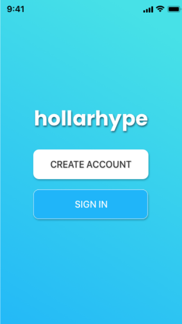
From the wireframes the team moved into medium-high fidelity mockups for four rounds of prototyping on InVision. We started first with the Welcome and Signup Page and after during the prototyping we learned that:
That the wording was not cohesive with the style guide and we went from Becoming a Member to Creating an Account.
The initial screen with the Email and Phone Number had no correlation to the Sign In link at the bottom of the page.
The proximity on the first page was the problem and users were not aware that they were form fields and not buttons.
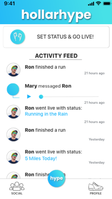
Users were not finding the share button in the top right corner of the header. The team created a button that simply says ‘INVITE’ to prompt primary users to share the app with secondary users.
The team also discovered that majority of users were frustrated that they had to upload a photo, the Choose Icon option was created to be used in place of a photo.
Conclusion
OUTCOME
The main goal of this project was to create an effortless and fluid onboarding process for both the primary users who use this application for motivation and the secondary users who want to be able to sign up easily and motivate others.
REFLECTION
Throughout the progress of this project the team learned about accessibility and the Contrast Ratio website was introduced to us. When testing the current colors they did not pass accessibility requirements. From there we worked with a color designer and she offered up some new possibilities for color. Throughout this process there were some many idea that for V2, below there are several other considerations:
A Third Party Sign In Feature, through Facebook for example.
UX Writing, for better consistency.
“Hype” Button, a lot of users were unsure of what it actually did.
In-App Tutorials on How to user Hollarhype.
Optimization for other devices, currently the app is only available on iOS. .
The possibility to expand the apps reach and make it more integrated into everyday life.


