FANDANGO APP
“Fandango is the ultimate digital network for all things movies, serving more than 67 million unique visitors per month globally with best-in-class movie information, ticketing to more than 45,000 screens, trailers and original video, home entertainment and fan merchandise.”
PROJECT BRIEF
After purchasing Rotten Tomatoes, Fandango wanted to expand its ability as a provider of reviews. Through the in-movie experience, they wanted my team to conceptually incorporate features such as taking bathroom breaks during the movie.
ROLE
My role was of a Visual Designer. I collaborated with other team members during the initial sketching process and during the design studio and was responsible for taking the sketches and digitizing them on Sketch.
Research
INTERPRETING THE USER
Initially we put together a screener to help identify movie going candidates. The screener questions were designed to highlight the participants movie going preferences, from demographics to interactions with their mobile devices. The survey information was used primarily for quantitative data.
SYNTHESIZING THE RESEARCH AND DATA
THE PROBLEM
Fandango wants a way to provide moviegoers with features that assist with planning ahead, such as reserving seats or ordering food; and the option to be informed of a good time to leave if necessary, allowing the moviegoer to feel more prepared.
We looked at how user’s planned for going to the movie.
What did they want the app to do?
How would they use that app?
How often were people using their phones.
ATTEMPTING TO SOLVE THE PROBLEM
Through our research analysis, we found that the majority of users wanted the ability to reserve seats and order concessions ahead of the movie.
From our interviews we learned that only some of the users check their phones during the movie and when they do it is only 1-2 times.
The users wanted the Fandango app to assist with planning ahead. We could simplify that by allowing for the customization of planning, arriving, and viewing a film.
BUILDING A ‘PROTO’ PERSONA
The Prepared Moviegoer
The Design Process
INITIAL SKETCHING
The Initial Sketching started with a Design Studio. It centered around choices regarding layout, functionality, and features. The sketches from each team member were similar in style and ideas for how the pages would look.
PAPER PROTOTYPE
After the Design Studio, we diverged. I was in charge of sketching the Paper Prototypes so that there would be consistency throughout. Since the Initial Sketches were all very similar, it was an easy process to combine them.
From the Paper Prototype, we converged for a Participatory Design, going through a chain of tasks similar to what the scenarios would be. The team added any missing pieces and revamped pages that I would create in Sketch.
DIGITAL WIREFRAMES
From there, I began the process of digitizing the prototype as wireframes in Sketch. We decided that we were only going to make a select number of new screens to introduce the alert feature since that was our main focus.
ITERATIONS
These are some of the digital iterations from start to finish while creating the new conceptual feature in Fandango. We used screen captures to enchance the other screens used in our prototype to reflect the Fandango color scheme and keep all the pages in sync.
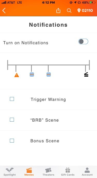
In Sketch we designed the Timeline Function on the alerts screen. Different icons representing different alerts, such as a ‘BRB’ or a ‘Trigger Warning’ were placed along the timeline that displayed the length of the movie. These alerts were chosen by the user so they were notified during the movie. The plot points information would come from reviews from Rotten Tomatoes.
Conclusion
OUTCOME
From the beginning, the user was more interested preparing for the in-movie experience than receiving alerts. We focused on building out interactions that allowed for pre-ordering concessions and reserving seats on the app. The goal was to make Fandango more of an all in-one-platform. We believed by doing this we would encourage more movie-goers to use Fandango for all their movie-going needs.
REFLECTION
Throughout this sprint, we wanted to showcase the option for users to choose alerts on their phones according to their preferences. This would allow them to be notified of a good time to leave the theater or to set alerts that would warn them of any sexually explicit, violent, racist, or gore during the movie. We got caught in a scope creep which led to a limited approach to the alert system. Below are some concepts for furthuring this feature to allow the users to be better prepared:
Introduce the alert feature on the Fandango app so that the user’s know where and what it is.
Enhance the icons for the various alerts so that they have easier learnability.
Also update the timeline and make it more clearer of what each icon represents. See Examples


